The Histogram is a Helpful Tool
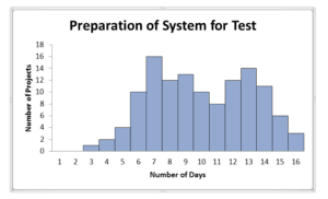
Like the Ishikawa Diagram, the Histogram can serve us well. The histogram allows us to visualize the trends based upon a category. It is a graphical distribution of data, in the example below we see the distribution of the duration to prepare an incoming vehicle to be a suitable device to put under test out of 126 projects. From this graphic we can make some assessments about how long this event (should it be in our project schedule) may take to accomplish. We can see, for example, that a project should not expect to see this objective accomplished in 1-3 days. It could happen, but the probability of success does not look good based upon the distribution in this chart.
This chart tells only ½ of the story. The next set of questions we would want to ask (if we do not like this distribution) would be focused upon what makes the duration distribution this way. Perhaps we would employ our other friend Pareto or Ishikawa or both to determine the causes of the variation. If we want to have any chance of changing this performance, we must know why it is this way.

